Yikes! It is time to upgrade or create your first ever REALTOR® website. We wanted to provide you with a couple tips gathered from buyers/sellers and our web-team.
Here are the 6 things you should keep in mind (Whom ever your provider is):
-
Avoid multiple ‘call-to-action’ buttons that can make a site seem cheesy and overdone.
What Not To Do:
- Advertising Free Service – ‘free home survey, free photography’ does not sell a Real Estate Agent whose job is to do the advertising.
- Crazy Flash Introductions – Not all versions of Flash work on your homeowner’s Apple Products. In a recent survey, most homeowners are apple owners themselves.
- Avoid animated images or cheesy flashy characters – Always remember, “What’s In It for Them?” An animated image will not determine whether it’s a good sale. Keep images focused more on properties then overdone for-sale signs and tacky advertising.
What To Do:
- Using Subtle Call-to-Action – “Let’s Grab Coffee” is personable.
- Organized website – Whether its menu’s or a very boxed look. Keep your navigation simple and easy for all your viewers.
- Display your email – Avoid Contact Forms. Not every potential lead feels comfortable filling these out.
-
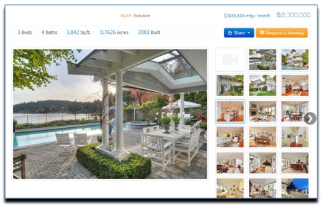
Use a Site Provider That Enables Larger Property Pictures
Advertise your listings with photography in mind. A majority of your clientele want their home shots to be the jewel on your website. Showcase their sale.

Example: Pixilink 3.0 sites always feature large images compared to any other website providers. Looking to upgrade? Let us know! -
Create Content
Google and most search engines now prioritize your site with the amount of unique content you have. Talk about the area’s you sell in and what differentiates you. The more you write, the greater the chances of people visiting your site are.Update your blogs and update your content.Possible Menu Items/Pages:
- The Communities
- Grew Up here Blurb
- Small sections describing places you know with links to dinning/shopping/schools.
- Since this site is a lot of content writing (this will be SEO friendly – which means more unique content – the better your chances of GOOGLE prioritizing you at the top of the list as a sellers agent)
- Examples of some reciprocity in that area.
- My Value Proposition
- This is the description of how you value the client relationship and how you believe that working with them is why you are in the business. You’ve seen other REALTORS® and you where not satisfied on how they performed. You want to do something different and you want to make their sale big.
-
Differentiating Yourself
We Suggest setting up 1 section that is a table that will look something like this:
Every Real Estate Agent does the following:- Puts it on MLS
- Does an Open House
- Maybe promotes it in the paper
- Takes a photo (low resolution – not appealing to the buyer)
Here is what I (as a Real Estate Agent) do differently:
- I provide you the current prices in the neighborhood
- Professional media (Floor plans, photography)
- Video Services
- Answer my phone calls (within 30 minutes)
- I follow up with all potential buyers
- Etc.
-
Showcase Your Work!
Fill in all the items you do- that goes above and beyond. In advertising, I look at other sites, not their biography or their REALTOR® action shots but their work for clients. This is usually examples of the photography, the polished product or your advertising plan.
Examples:
- Floor plans
- Photos
- Media Packages
- Advertisements
- List of your Featured Sold Listings
- Your Professional Website
-
Add Reciprocity Category Searches to Your Site
SEO (Site Engine Optimization) Friendly searches created by taking all listings in an area. Can potentially increase the amount of visitors you have by putting you on Google as one of the sites featuring any number of those properties. These are only $50, one time set-up which act as an SEO component to your Pixilink Site.
